
[This article can be treated as a summary of the legendary book How to Lie with Statistics by Darrell Huff published in 1954.]
We live in a world built on numbers. They are the foundation of our reality, the bedrock of our arguments, and the ultimate mic drop in any debate. “Numbers don’t lie,” the saying goes. But if you stop for a moment, sit down with a cup of tea and really look at them you realize that while numbers themselves might be neutral, the people using and misusing them rarely are.
Darrell Huff, back in 1954, saw this coming. In his delightfully cynical yet essential manual, How to Lie with Statistics , he pulled back the curtain on the black magic of data manipulation. It is not just about dry mathematics, it is about the psychology of persuasion. It is about how a toothpaste company convinces you their paste is a medical miracle, or how a politician makes a failing economy look like a booming paradise.
Think of statistics as a knife. In the hands of a skilled surgeon (an honest statistician), it can cut away ignorance and reveal the truth. But in the hands of a con artist? It’s a weapon used to alter reality into whatever shape suits them best. Huff warned us that the “secret language of statistics” was being used to sensationalize, inflate, confuse, and oversimplify. And that was before the internet! Today, the stream of misinformation is endless.
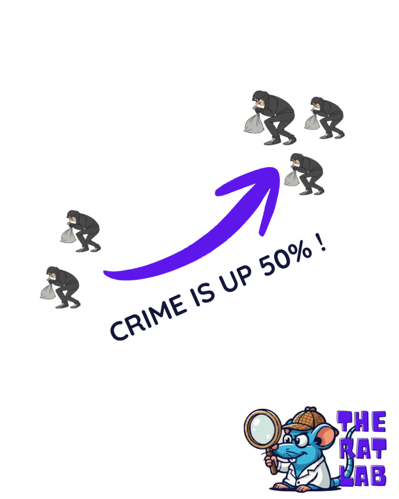
This matters because these distortions govern our lives. They decide which medicines get approved, which laws get passed, and where your tax money goes. When a report says “Crime is up 50%!” but fails to mention that the raw number went from 2 burglaries to 3, you are being manipulated into fear. When a salary report claims the “average” employee makes INR 50,000, hiding the fact that the CEO makes 5 Crore while everyone else scrapes by, you are being manipulated into complacency.
So, let’s take a walk through Huff’s methods to lie with statistics.
1. The Sample with the Built-in Bias (Base of Statistics)
Let’s start where most statistical lies are born: the sample. Huff opens with a classic story about the “average” Yale University graduate of 1924. Years later, it was reported that these alumni were making an impressive annual income, far higher than the national average. It painted a picture of an elite Ivy League education as a guaranteed golden ticket.
But hold on. Who did they ask? They sent questionnaires to people whose addresses they had. At that time, in the 1920s who had the known address? People with stable lives, usually the wealthy. Who bothers to fill out a questionnaire about their salary? People who are proud of how much they earn. The struggling artist living with his parents, the guy who went poor after gambling and is dodging, they of course didn’t reply. They weren’t even found.
This is often called Selection Bias. This is the “Built-in Bias.” It is the error introduced when the group you study doesn’t actually represent the whole group you’re talking about.
Imagine you want to know if there is a large amount of the population that does not approve of the current government. You decide to conduct your survey only at government offices, asking questions to the employees. Your sample in the first place will be wrong.
So What? This tricks us into believing niche opinions are universal truths. If a political poll only calls landlines, they are missing an entire generation that only uses cell phones. The result isn’t a snapshot of the country, it’s a snapshot of people who still own landlines.
2. The Well-Chosen Average
This is perhaps the most common lie in the book. Let’s say you want to rent a flat and want to live in a neighborhood where average income is higher than 20 Lacs/year for whatever reason. You go to a broker and they say, “The average income in this neighborhood is 25 Lacs”. Sounds delightful, right? A solid, upper-middle-class area which you are looking for. But once you move in, you realize everyone in the area is struggling to make ends meet. How did the broker lie?
They didn’t. The broker used the arithmetic mean. Maybe the neighborhood is full of struggling families, but one billionaire lives in the mansion. You add up all their incomes, divide by the number of people, and boom—the “average” is high. But if you asked for the median (the person exactly in the middle) or the mode (the most common income), the number might be 3 Lacs.
Mean vs. Median vs. Mode “Average” is a chameleon word. It can mean three different things, and the liar picks the one that supports their story.
So What? This is used constantly in economic discussions. When you hear “The average tax cut is INR 10,000,” that could mean one billionaire got a million-dollar cut and everyone else got zero. The “average” hides inequality.
If I am sitting in a diner and Bill Gates walks in, the “average” wealth of everyone in that diner just skyrockets to a billion dollars. But I certainly didn’t get any richer to pay for my coffee.
3. The Little Figures That Are Not There
Huff introduces us to a toothpaste ad. The headline screams: “Users report 23% fewer cavities with Doakes Toothpaste!” It sounds rigorous. It sounds scientific. But look closer at the fine print or the figures that aren’t there.
How many people did they test? In this case, the company might have tested a group of just 12 people. If purely by chance, a few of them didn’t get cavities (maybe they have good genes, or they just happened to brush well that week), the percentage swings wildly. If they didn’t like the result, they just scrapped that test group and tried another group of 12 until the “luck” landed in their favor.
Statistical Significance (or Lack Thereof) This is the trick of using a sample size so small that the results are basically random noise, then presenting it as a hard trend.
It is like flipping a coin twice, getting heads both times, and declaring, “This coin is magical! It comes up heads 100% of the time!”
So What? This is the bread and butter of deceptive advertising. “33% of women saw fewer wrinkles” sounds great until you realize they only asked three women, and one of them was just squinting less. It creates false confidence in unproven products. Reads the asterisks and following conditions and presets of the data.
This is like saying – I could prove that eating pickles causes car crashes. I found one guy who ate a pickle and then crashed his car. 100% correlation! But if I don’t tell you I ignored the million other pickle-eaters who drove home safely, I am lying by omission.
4. Much Ado About Practically Nothing
Let’s talk about IQ scores. Huff gives the example of Peter and Linda. Peter has an IQ of 98. Linda has an IQ of 101. Parents and teachers might say, “Linda is smarter.” Huff argues this is scientific nonsense. (Though the definition of IQ has been questioned – that is a different discussion altogether.)
Why? Because every measurement has an error margin. An IQ test isn’t a precision laser, it’s a fuzzy estimate. The “probable error” on an IQ test might be +/- 3 points. That means Peter is really somewhere between 95 and 101, and Linda is between 98 and 104. Their ranges overlap completely. Statistically, they are the same. Treating 101 as superior to 98 is making a mountain out of a molehill.
Probable Error (Standard Error) This is the “plus or minus” that honest statisticians include but liars leave out to create artificial rankings.
Think about measuring the length of a room using a stretchy rubber band instead of a steel tape measure. You get “10 feet” one time and “10 feet 2 inches” the next. You can’t claim the room “grew” by two inches; that’s just the wobble in your rubber band.
So What? We see this in headlines like “Candidate A leads Candidate B by 1%!” If the margin of error is 3%, that lead is imaginary. It’s a tie, but “It’s a Tie” doesn’t sell newspapers.
5. The Gee-Whiz Graph
This is one of the most visual lies in the book. Huff describes a graph showing a rise in national income. If you plot it honestly, starting the vertical axis at zero, the line goes up gently—a slow, modest slope. It looks boring.
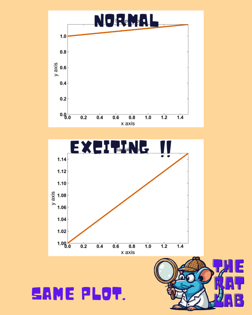
So what does the clever liar do? They chop off the bottom of the graph. Instead of starting at 0, they start the axis at 20 million. Now, that modest rise looks like a rocket taking off! The slope is exaggerated. It is the same data, but the visual impact is emotionally manipulative. Huff calls this the “Gee-Whiz” graph because it forces the viewer to say, “Gee whiz (Wow!), look at that rise!” Similarly one can be mathematically right but manipulative in different ways to misrepresent a plot.
Truncated Axis Cutting off the baseline (the zero point) to exaggerate the steepness of a curve.
It is like looking at a small mound of dirt through a pair of binoculars while lying on your stomach. Suddenly, that molehill looks like Mount Everest because you have lost the context of the horizon.
So What? Stock market apps do this constantly. A stock drops 1%, but the graph (zoomed in tight) looks like a crash off a cliff. It induces panic where none is warranted.
Think about a child who grew one inch last year. If I draw a graph of his height starting from the floor, he barely changed. If I draw the graph starting from his neck, that one inch looks like he doubled in size!
Here are some ways charts mislead.
6. The One-Dimensional Picture
Here, Huff warns us about pictographs. You want to show that the average carpenter’s wage has doubled. You could use a bar chart, where the second bar is twice as tall as the first. That is honest.
But the “creative” statistician uses a drawing of a money bag or a cow. To show double the income, they make the money bag twice as tall. But to keep the proportions right, they also make it twice as wide. Now the area of the bag is four times as big. If it’s a 3D drawing, the volume is eight times as big! The impression given isn’t “double”—it’s massive, overwhelming growth.
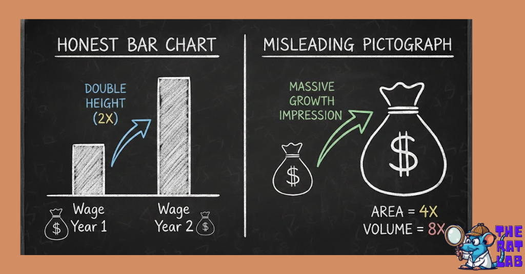
Dimensional distortion Using area or volume to represent a one-dimensional number, drastically exaggerating the difference.
So What? This technique is a favorite of alarmists. A graphic showing military spending or debt often uses these ballooning icons to make the increase feel terrifyingly large, triggering an emotional response rather than a rational one.
This lie is like – If I say I have twice as much water as you, I should show two glasses. If I instead show a bucket that is twice as tall and twice as wide as your glass, I am tricking your eye into thinking I have an ocean.
7. The Semiattached Figure
This is the art of answering a question nobody asked. Huff cites a classic advertisement: “Nostrum Cures Colds.” The proof? “Kills germs in a test tube.”
Wait a minute. A test tube isn’t a human throat. Almost anything kills germs in a test tube—bleach, fire, a hammer. The figure (germs killed in tube) is “semiattached” to the claim (cures colds). There is a gap in the logic that the advertiser hopes you will jump over without looking.
Irrelevant Proof Providing data that proves something, just not the thing being claimed.
It is like a car salesman telling you, “This car is incredibly fast!” and proving it by dropping it out of an airplane. Yes, it is moving fast, but that has nothing to do with how it drives on the highway.
So What? Politicians love this. “We need to cut funding because the program is expensive.” They prove it’s expensive (the figure), but they don’t prove it’s ineffective (the claim). They attach the cost figure to the effectiveness argument.
8. Post Hoc Rides Again (Correlation vs Causation)
“Post hoc ergo propter hoc”—after this, therefore because of this. Huff brings up a study showing that college students who smoke have lower grades. The immediate, knee-jerk conclusion? Smoking burns brain cells! Smoking causes stupidity!
But Huff, channeling his inner skeptic, pauses. Could it be that students who are struggling socially or academically are more depressed and therefore smoke more? Could it be that “sociable” types who party more (and study less) also smoke more? The correlation is real, but the causation is a guess.
Correlation vs. Causation Just because two things happen together doesn’t mean one caused the other.
Every morning, the rooster crows, and then the sun rises. If you are a naive statistician, you assume the rooster caused the sun to rise. If you kill the rooster, you might be terrified of eternal darkness.
So What? This leads to dangerous policies. If we think “Video games cause violence” just because they correlate in some study, we ban games but ignore the root causes of violence (poverty, mental health), fixing nothing.
Another funny example is, Ice cream sales and shark attacks both go up in July. Does ice cream attract sharks? No! It’s just hot outside, so more people swim and more people eat ice cream. The heat is the hidden cause.
Read this for fun: What’s Behind the Myth That Storks Deliver Babies?
9. How to Statisticulate
Huff coins a beautiful term here: “Statisticulation”—statistical manipulation. He focuses on the use of maps and deceptive precision.
Look at a map of the USA showing “States where the Governor is Republican.” If huge, empty states like Montana and Wyoming are colored in, the map looks overwhelmingly red. It implies a landslide victory. But those huge areas might have fewer people than a single tiny blue dot like New York City. The map lies by giving land a vote, rather than people.
He also touches on false precision. Saying “The average American sleeps 8.043 hours” sounds incredibly scientific. Saying “about 8 hours” sounds like a guess. We trust the decimals, even if the data was rough to begin with.
Map Manipulation & False Precision Using visuals or overly precise numbers to lend an unearned air of authority.
It is like measuring the length of your room with a micrometer. You can say it’s 10 feet, 4 inches, and 2 millimeters,” but if the room edge is jagged due to uneven plastering, that precision is a joke. It’s fake accuracy to establish that you have given too much effort to measure.
So What? Election maps are the worst offenders. They make a divided country look entirely one-sided. And precise numbers (“This plan will save INR 14,567,231”) shut down debate because who argues with such a specific number?
If I guess the weight of a jellybean jar is 500, you might doubt me. If I say it’s 503.2, you think I calculated it. I didn’t. I just added a decimal to fool you.
10. How to Talk Back to a Statistic
Finally, Huff arms us. He doesn’t just want us to see the lies; he wants us to fight them. He doesn’t offer a mathematical formula, but a set of common-sense questions.
He tells the story of a “survey” on corporations. The results looked great for the business owners. But when you asked “Who says so?”, you found out the survey was funded by the corporations themselves. The data wasn’t science; it was PR.
The 5-Question Defense A skeptical framework to dismantle any stat you see.
It is like buying a used car. You don’t just kick the tires. You ask to see the engine, you check the history report, and you ask, “Why are you selling this?”
So What? If we don’t ask these questions, we are passive consumers of propaganda. “Talking back” turns us from victims into informed citizens.
If a guy in a trench coat tries to sell me a “genuine diamond watch” for 500 Rupees, I don’t need a microscope to know it’s fake. I just need to ask, “Does this make sense?”
Takeaway: Your Anti-Lie Cheat Sheet
Huff left us with a toolkit. Here is your ten-point defense strategy to keep in your back pocket whenever you turn on the news or read a “groundbreaking” study.
- Check the Source: Who paid for the study? If a tobacco company says smoking is safe, that’s not a stat; that’s an ad. (Ch 1)
- Ask “Which Average?”: If they say “Average,” ask if it’s the Mean (skewed by rich guys), the Median (the middle man), or the Mode (the most common). (Ch 2)
- Demand the Count: “33% success” means nothing if they only tested 3 people. Always ask for the sample size (N). (Ch 3)
- Look for the Range: Ignore precise numbers without a standard error. Linda’s IQ of 101 is the same as Peter’s 98 if the error is +/- 5. (Ch 4)
- Watch the Y-Axis: If a graph starts at 50 instead of 0, someone is trying to make a molehill look like a mountain. Redraw it mentally. (Ch 5)
- Beware of Pictures: If a money bag is twice as tall and twice as wide, it’s a lie. Look at the numbers, not the ink. (Ch 6)
- Bridge the Gap: Does the data actually prove the headline? Curing germs in a test tube is not curing a cold in a human. (Ch 7)
- Find the Hidden Cause: Correlation is not causation. Just because two things happen together doesn’t mean one caused the other. (Ch 8)
- Don’t Be Dazzled by Decimals: 3.14159 is suspect if the original measurement was “about 3.” Precision does not equal accuracy. (Ch 9)
- The Gut Check: Does it make sense? If a stat contradicts everything you know about the world, it’s better to double check. (Ch 10)
Statistics is a powerful language, but it is a dialect that can be spoken with a lying tongue. Keep your eyes open, your skepticism sharp, apply rational thinking and your hand on your wallet.
📚 Recommended Reads
-
How to Lie with Statistics
🔗 Amazon |
Amazon India